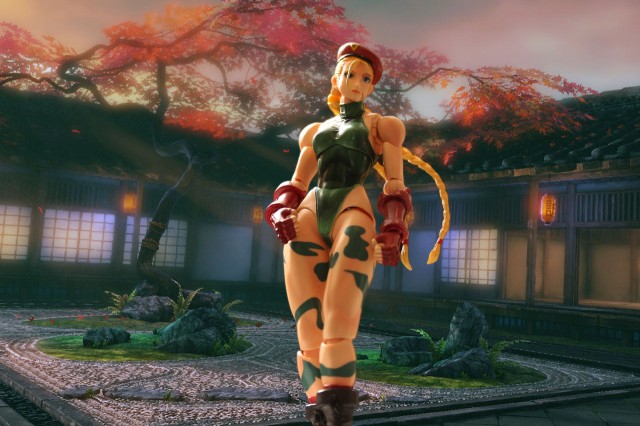
I’ve been gushing for some time about Square Enix’s Play Arts Kai line (see the latest from Square Enix from San Diego Comic-Con), and after opening up Street Fighter Cammy felt compelled to take a quick and simple picture. Of course, you know what they say about best laid plans – this was not as quick and simple as I’d have liked, but I’m pleased with how this shot turned out after making some easy adjustments, despite not really doing any up front planning for it. In this article, I’ll explain a couple of things that I did to compose this shot in Photoshop.
First, let me reiterate that the Play Arts Kai line is really kicking ass when it comes to super-poseable figures. For those of you uninitiated with this line but familiar with Bandai’s S.H. Figuarts, the articulation scheme is very similar – but the larger 8-inch scale makes for a much sturdier figure. I’ll have to do a real review one day, but suffice to say that the awesomeness of Cammy was something that demanded this picture. I have a lot of figures nearby my computer all the time, but this hand candy would not be denied.
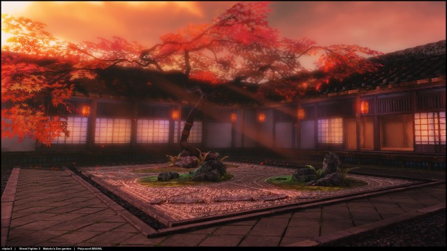
After getting Cammy in the basic pose that I wanted, I set about looking for a suitable backdrop and found this image, a recreation of a Street Fighter 3 stage, in this thread on the Capcom Unity forums. There’s a bunch of stage backdrops there, so I imagine I’ll be using more of them in the future – very cool stuff.
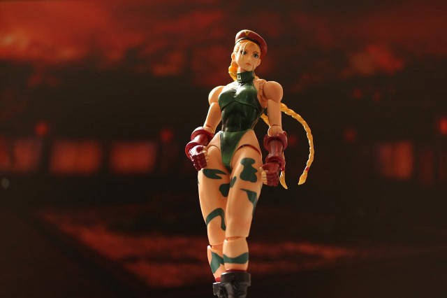
My mantra is to make the setup as simple as possible, so I displayed the background full screen on my computer monitor, set a remote flash behind, to the left, and above my monitor, and stood Cammy up in front of it all. Unfortunately, I haven’t really found a way to shoot using my monitor as a backdrop without that backdrop being color distorted or washed out.
Although I kind of like the shot that my camera captured, it wasn’t what I was going for. So the first step was to combine the Cammy from this shot and replace the background with the original image I found earlier. I won’t cover this in detail here, because I followed the typical steps I covered in my Skeletor and Evil-Lyn – Easy Photoshop Tips for Difficult Compositions write-up. I did do a couple more things which I’ll cover here.
With the basic shot composed, I wanted to create some depth of field by blurring the background. However, I wanted to have the effect that the closer the ground was to Cammy, the more in focus it would be.
This is actually pretty simple to do in Photoshop. First, create a duplicate layer, and apply a gaussian blur to it. Then use Layer > Add Layer Mask > Reveal All to add a layer mask, and then apply a gradient to the blurred layer. The idea here is that via the gradient, we’ll reveal the unblurred layer beneath the blurred one, moreso at the bottom of the photo than at the top. Since Cammy is at a slight angle for dramatic effect, I made sure the gradient I applied to the layer mask was at an angle as well.
Next, I wanted to compensate for the slight overblown look on Cammy’s right side – the result of using the flash against the lesser lighting in the home office. To do this, I selected my blurred background layer and used Filter > Render > Lighting Effects… to add a Spotlight coming from the top left of the screen. The background render had some light beams showing, so I kept the angle of the spotlight parallel to these light beams.
With the gradient blur and spotlight added, as well as some minor level and color adjustments, here’s the final image once again:
I hope this gave you some ideas for future photo compositions. Please share your photography and Photoshop tips by leaving a reply below. Thanks!


