I’ve probably mentioned one or two times that I’m a Deadpool fan. And while Daniel Way was writing Deadpool, there was no better Deadpool around than Rick Remender’s Deadpool in Uncanny X-Force. (I’m gonna have to check out the new Deadpool now that Way’s run is finally done.) In the first issue of Uncanny X-Force, there’s this scene where Deadpool is standing on top of the head of this huge statue spewing out a toxic green waterfall from its mouth.
Why did the nickel jump off the building but the dime didn’t? [Deadpool dives!] Dime had more cents.
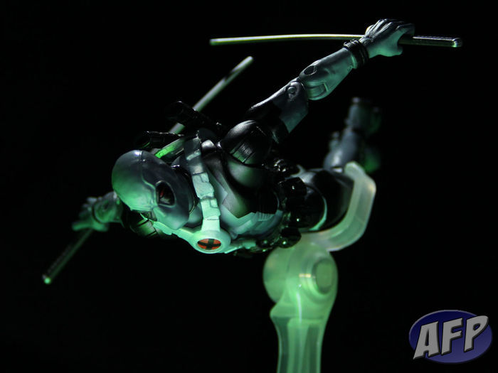
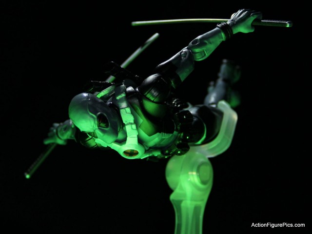
That panel by Jerome Opena had such a dynamic look, that when I got the RoML 3 Deadpool (yay, X-Force colors!) I wanted to see if I could do it justice in a picture. I thought I hit it in the first shot… but I’ll show you how it evolved during the process to result in what you see above.
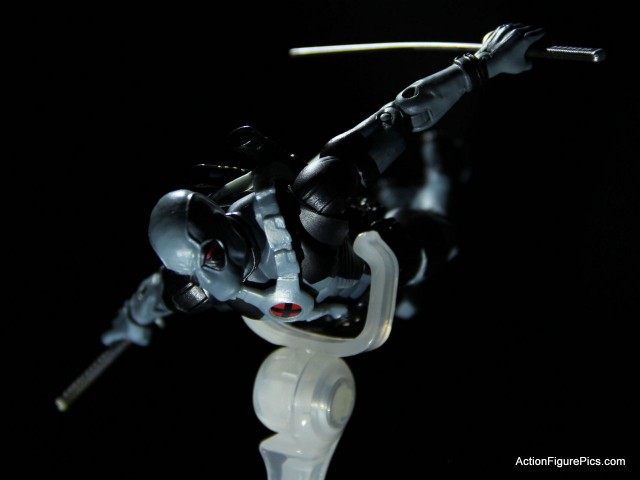
Above you’ll see one of the first shots I took. One of my LED book lights is aiming down at him from behind and to the left of the frame. The other is almost right under my camera lens. I almost stopped here, and probably would have been pretty happy with the results.
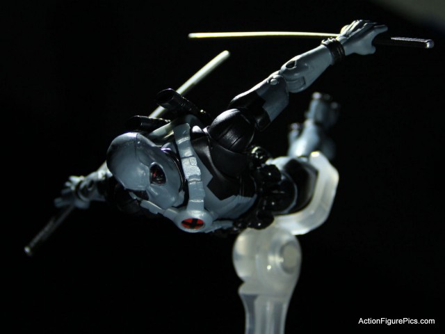
Practically the same setup, but I’ve moved the stand back to his legs so it doesn’t quite obscure as much, and adjusted his sword and head so you could see more of them.
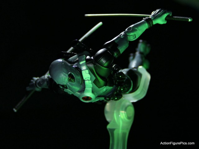
Although the comic panel that inspired the shot doesn’t have this, I thought it would be cool if Deadpool were illuminated by the waterfall. So I used a flashlight app on my tablet to shine some green light on him. In the first shot, I was holding the tablet off frame to the right.
Almost done – instead of holding the tablet, I decided to put it underneath the stand, so it would shine up directly on him. In contrast with the last shot, this has the head and torso lit up pretty nice, and since that’s the focal point, I want strong green light there. The problem is that the red in his eyes and on the logo in his harness is getting washed out by the green.
Here’s the final shot again. My flashlight app has one setting where it has an image of a lightbulb surrounded by a background. Using that, I was able to get some white light shining up with green highlighting the edges. That’s brought back the red in the logo and the eyes.
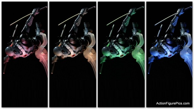
Of course, if you can get a shot set up and experiment with the lights, that’s always fun.
That’s not Photoshop – well, ok, I used Photoshop to rotate the image and then Picasa to put the four pictures together. For the colors, I just adjusted the flashlight by dragging my fingers across it for the four different shots. Thanks for looking!

That looks good. I like the way you take pictures for these figures, good work.