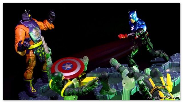
I am probably going to have to give this another try at some point – I only had a short while to set this up and snap some pictures, and when it came time to do some post work I didn’t much like the composition. As much as I miss having a Build-a-Figure in the third wave of (Return of) Marvel Legends, I do like the interconnecting bases. The idea for this shot was to use them as a raised platform, with Bucky fighting through the Hydra troopers towards Arnim Zola.
Right off the bat, I should switched Zola and Bucky around – eyes (at least in most Western cultures) will track from left to right, and so this shot would probably work better if the eye could follow Bucky’s shield from left to right. I think the idea that the platform is raised has been lost because of the angle of the shot. And then there’s this big empty spot in the middle of the shot. It’s not that I don’t believe in negative space – I just didn’t really think it through here and it seems off.
Any thoughts on how this shot could be improved?


Vertical orientation, as if Bucky-Cap leaping down onto Zola + Hydra goon from on high. Shield near bottom of the screen, Zola + Hydra recoiled back toward sides. Negative space filled by star/stripes on Bucky-Cap’s costume.
@hawkinshand – thanks for the suggestions! I have another take on it that I’ll post later, but have since sacrificed Bucky for a custom. I have a replacement on the way, though, so I’ll give your composition a try in a few days.