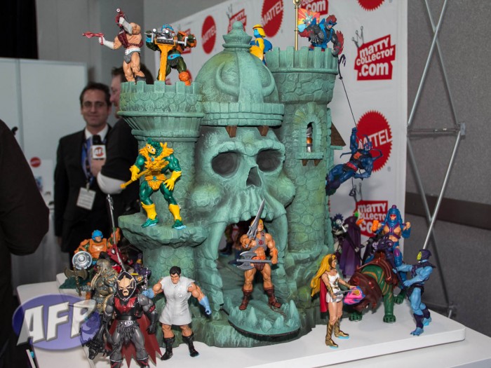
With the final pre-order window coming to a close on Monday, I’d like to take a pulse check on where you stand on Castle Grayskull – and no, that’s not a flimsy attempt at escape ledge humor. Up until Toy Fair, we had seen drawings, foam mockups, and teasers – now that the first painted prototype has been shown, what’s the verdict? Has seeing the Castle changed your mind one way or the other?
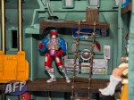
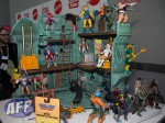
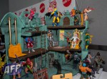
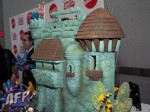
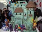
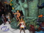
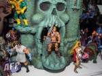
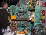
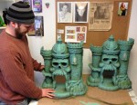
Let’s start with our pics and video from the Mattel Toy Fair event:
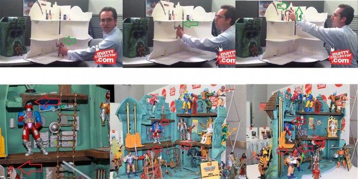
I’ve seen a lot of comments about the Castle prototype being smaller than what was represented on the b-sheet. He-Man does look a little cramped in the jawbridge. With regards to the interor, the folks at he-man.org put together this comparison image showing how the thickness and offsetting of the floors (to allow the Castle to close) in combination with the reduced height makes for some tight fits:
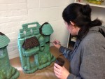
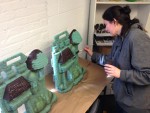
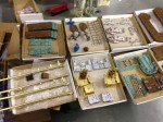
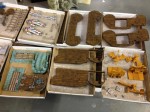
There’s no doubt that the Castle will feature some impressive sculpting and paint work, if they can match what the work the Four Horsemen have done in their studio for the paint masters:
via Castle Grayskull.
Finally, Toy Guru has responded to the requests to make changes to the Castle in this thread at he-man.org. There’s quite a bit of pre-amble, but the net is that while he wishes he could make the Castle bigger, there’s four things they are actively looking at changing:
In the end, this is going to be an amazing peice [sic] and I hope will please the majority of fans. We are actively working on the following changes from what was shown at NYTF:
- Adding a slot in the throne for the Sorceress’ tail feathers.
- Adding a slot/crack by the Jaw Bridge for the Power Sword (like in the mini comics)
- Adding a key hole in the back door that fits Scareglow’s key
- Lowering the Jaw Bridge door into the base for a taller opening
Beyond that, their [sic] just is not time or resources to make changes. We 100% hear fans on many suggestions, but when we say “no we can’t make that change” it is not meant as an insult, it is just letting fans/customers know that factually that change can’t be made. If I gave the impression that the model shown in NY was going to change, then bad on me. But to be clear now, their [sic] won’t be changes beyond what was shown and noted above. We hope everything shown in NY will be in the final toy, but their is always a chance things may change/get cut. If that does happen, we will be sure to let everyone know.
So there you have it – hopefully enough info on which to base your decision about Castle Grayskull, if you haven’t already made up your mind. And the big question is:
If you have other thoughts about Castle Grayskull, be sure to leave a reply below. Thanks!


I will not be buying at all. Too expensive. Plus….The one on Jim Smash blog was amazing and much bigger…AND I can make it for much cheaper the money.
There wasn’t an option of “After I saw the prototype I decided not to order” so I just chose the last one.
I think that poll choice works for what you wanted. what was it about the prototype that made you decide not to order?
I am still buying it, but now that I see how short it has become, I am pretty let-down.
I pre-ordered but am considering canceling. I actually don’t mind that it’s smaller on the whole, but the head clearance is really ridiculous, especially compared to the mock up. The figures just look silly in there. I kind of wish they’d just stuck with the two-level layout of the original. And I strongly dislike the raised lower floor. Why is that even necessary? To accommodate the Wind Raider platform that nobody wants? I wish they’d scrap it and put the bottom floor on the ground like the original. Sculpt aside, this thing shows just how well done the original castle was. I wish they’d go back to that. If the bottom floor remains raised and supported by pegs, I may have to bail.
@SamuRon I was very excited about ordering castle grayskull, and had planned to during the original “are we going to go forward or not” pre-order. After seeing Toy guru’s foam board castle grayskull, I was concerned that the scale would make the figures look crammed in there, and seeing the prototype confirmed it.
I guess what they did was take the scale of the original playset to the original figures, and used that to scale this one. Ultimately it comes off looking too small for me; but I wanted to see the actual prototype before I decided.
The size was the biggest turn-off for me. It’s slightly bigger than the 200X Castle. The pics and video made me realize that the Classics Castle is PERFECT for 200X sized figures but acceptable for Classics Figures. Since I already have a castle that is acceptable for MOTUC figures (and it has better clearance between the first and second floor than the MOTUC Castle.) Worst case scenario, I’ll end up “arts and crafting” one…I hope that those who buy it, enjoy it… It’s just not big enough for me…
@SamuRon I feel like I should add that the castle still looks amazing, and I think anyone who has one will be thrilled. I don’t want to sound like I’m just pooing on it or taking cheap shots at Matty. I am very glad that Mattel is making it; there’s just a cost/size thing that doesn’t work out for me.
I think it’s a fair criticism and it didn’t come off as a cheap shot at all.
I think it’s a fair criticism and it didn’t come off as a cheap shot at all.