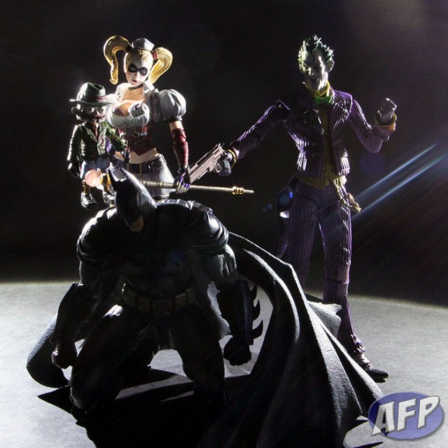
My setup time for pictures is usually pretty quick, because I find it more efficient to start snapping and correct on the go, than trying to get it perfect right off the bat. With this before and after shot of the Square Enix Play Arts Kai Arkham Asylum figures (they are really awesome, by the way), I’ll highlight some lighting issues you might come across and give you some quick and easy solutions for them.
Tag: How To
NECA Teenage Mutant Ninja Turtles – Using Photoshop Levels to Enhance Dramatic Lighting
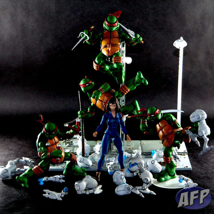
As much as I love what Playmates is doing with their Nickolodeon Teenage Mutant Ninja Turtles lines (stay tuned for some quick pics from Talyn coming up tomorrow), I have a special place in my collection for the NECA TMNT figures from a few years back. I had a picture of my TMNT setup from back when I added tap lights to my display cubes, but that picture was from before I had April.
Since then, the shelf and figures had gotten pretty dusty, so I took the opportunity to clean them up and take a new picture. In this article, I’ll also show you what I did in Photoshop with the Levels tool to enhance the lighting effects for this particular shot.
Art Asylum Star Trek – with Cheap DIY Light Reflector
Art Asylum’s Star Trek figures for the original series are still a stand out in my collection. I love how they customized each figure for the character’s physical attributes – Spock is taller than Kirk, who is taller than Sulu. Today, we’d probably just get one single body reused over and over. The head sculpts are spot on too – Shatner’s is probably the toughest to capture, and I think they did a great job with it.
I’ve wanted to take some shots of these guys for a while now, and this also became an opportunity to test out a quick and cheap light reflector I whipped up a while back. It hadn’t really done anything for my indoor shots, as I often have plenty of light available with my “studio” set up. So I took a little away team to the surface of planet RBY (Ron’s back yard) to see what the reflector could do with natural sunlight.
Continue reading “Art Asylum Star Trek – with Cheap DIY Light Reflector”
Street Fighter Cammy – More Easy Photoshop Tips
I’ve been gushing for some time about Square Enix’s Play Arts Kai line (see the latest from Square Enix from San Diego Comic-Con), and after opening up Street Fighter Cammy felt compelled to take a quick and simple picture. Of course, you know what they say about best laid plans – this was not as quick and simple as I’d have liked, but I’m pleased with how this shot turned out after making some easy adjustments, despite not really doing any up front planning for it. In this article, I’ll explain a couple of things that I did to compose this shot in Photoshop.
Continue reading “Street Fighter Cammy – More Easy Photoshop Tips”
Skeletor and Evil-Lyn – Easy Photoshop Tips for Difficult Compositions
This weekend I saw that Netflix added He-Man and the Masters of the Universe (all 130 episodes!), so I watched the first, The Cosmic Comet. There’s a scene in which Skeletor and Evil-Lyn scheme away, with Skeletor’s face filling the left side of the frame with Evil-Lyn visible over his shoulder. Thinking that it would be a good picture to recreate with the Masters of the Universe Classics Skeletor and Evil-Lyn, I tried – but could not. With the extreme closeup of Skeletor, I couldn’t set up my camera to keep both his face and Evil-Lyn in focus.
No problem! With Photoshop, I knew I could combine the elements I wanted from a few different pictures to get the composition I wanted. Best of all, it’s easy. Here’s what I did – you can use similar techniques to put together images that you normally couldn’t with a single shot from an ordinary camera.
Continue reading “Skeletor and Evil-Lyn – Easy Photoshop Tips for Difficult Compositions”


