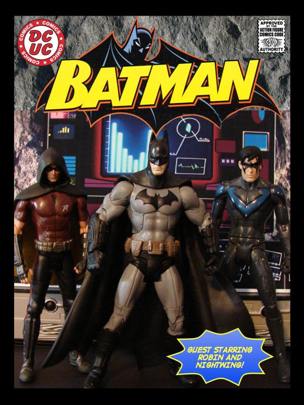
Bill has shared his latest comic, featuring Robin and Nightwing, with us. Be sure to check out more of his comics at Bill’s Comics.

Bill has shared his latest comic, featuring Robin and Nightwing, with us. Be sure to check out more of his comics at Bill’s Comics.

As much as I love what Playmates is doing with their Nickolodeon Teenage Mutant Ninja Turtles lines (stay tuned for some quick pics from Talyn coming up tomorrow), I have a special place in my collection for the NECA TMNT figures from a few years back. I had a picture of my TMNT setup from back when I added tap lights to my display cubes, but that picture was from before I had April.
Since then, the shelf and figures had gotten pretty dusty, so I took the opportunity to clean them up and take a new picture. In this article, I’ll also show you what I did in Photoshop with the Levels tool to enhance the lighting effects for this particular shot.
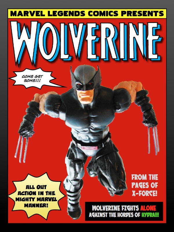
Bill has shared his latest classic Action Figure Comic with us. Be sure to check out more of his comics at Bill’s Comics.

Continue reading “Wolverine: If Looks Could Kill – BillsComics.com”
Art Asylum’s Star Trek figures for the original series are still a stand out in my collection. I love how they customized each figure for the character’s physical attributes – Spock is taller than Kirk, who is taller than Sulu. Today, we’d probably just get one single body reused over and over. The head sculpts are spot on too – Shatner’s is probably the toughest to capture, and I think they did a great job with it.
I’ve wanted to take some shots of these guys for a while now, and this also became an opportunity to test out a quick and cheap light reflector I whipped up a while back. It hadn’t really done anything for my indoor shots, as I often have plenty of light available with my “studio” set up. So I took a little away team to the surface of planet RBY (Ron’s back yard) to see what the reflector could do with natural sunlight.
Continue reading “Art Asylum Star Trek – with Cheap DIY Light Reflector”
I’ve been gushing for some time about Square Enix’s Play Arts Kai line (see the latest from Square Enix from San Diego Comic-Con), and after opening up Street Fighter Cammy felt compelled to take a quick and simple picture. Of course, you know what they say about best laid plans – this was not as quick and simple as I’d have liked, but I’m pleased with how this shot turned out after making some easy adjustments, despite not really doing any up front planning for it. In this article, I’ll explain a couple of things that I did to compose this shot in Photoshop.
Continue reading “Street Fighter Cammy – More Easy Photoshop Tips”